Here is the research and development process of my magazine project. I will put all of my ideas here and reflect on the decisions that I make. I have decided to separate my double page spread research and development from my front cover research to help me separate them and be more organized.
On this task, I was told to do research on any magazine, therefore why I didn't do all fashion magazines.
Research
Here is my first double page spread research from a fashion magazine called Vogue.
Before Reading |
Magazine: |
| Vogue |
Issue: |
| September 2023 |
Publisher: |
| A Conde Nast Publication |
Genre: |
| Fashion |
Images: |
| 7 images displaying clothing lines and the production process of the clothes. |
Layout |
| The first page contains 3 columns, 2 columns with a majority of text and 1 with majority of images. It has approximately similar amounts of texts and images, where there are various sizes and colors to the images. The page numbers are located on the bottom corner of the book. The magazine has few negative spaces yet enough for it not to look too crowded. |
First impressions: |
| I think the proportion of images and texts, as well as the variety of size and color in the images is very intriguing and prevents the double page spread from looking bland. I also like how the page isn’t too empty nor too full. |
After Reading |
Heading: |
| Displays of AFFECTION |
Subheading: |
| RADHIKA SETH spotlights four LONDON exhibitions celebrating sartorial EXCELLENCE |
Byline: |
| There are no bylines on this double page spread |
Article: |
| The article written on this double page spread is about the four main displays in London. |
Mode of address: |
| The article is written in a 3rd person POV, and is written in a formal and serious manner. |
Pull Quote: |
| The magazine doesn’t contain any pull quotes |
Audience: |
| Vogue's target audience are middle aged women who are fashion enthusiasts and have a strong interest in various fashion styles. Judging from the double page spread, Vogue's target audience may also consist of industry professionals such as designers, who look at Vogue's magazine for inspiration (Surveillance, Uses & Gratification theory by Blumler & Katz). |
Impression: |
| I personally think that this double page spread is very well organized. It conveys the high-class vibe due to its simplicity and elegance that Vogue wants to showcase, as they are a high-end magazine. The color used for the background of the page is white, which connotes cleanliness and class. This gives the page a very neat look. The way that the magazine was written in was very formal and serious, connoting that Vogue is professional. All these combined successfully helps Vogue connote that they are a high-end magazine, helping them reach their target audience easier and better. Although I still feel a little overwhelmed by the amount of text, as I don't quite enjoy reading articles. |
Inspiration: |
| From this research, I've learned that sometimes 'less is more'. As my target is also to create a high-end magazine, I could take notes from how Vogue targets their audience. A few things that I want to use inspiration as is to use formal language and use 3rd person as it makes my magazine appear more professional and classy. Moreover, I should take into consideration the placement, size, and amount of images and texts present in my double page spread as this also plays a role in how my magazine is represented. |
Website: |
|
|
Caption: |
|
|
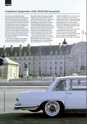
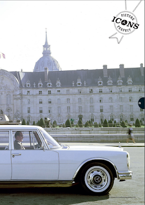
Here is my second double page spread research from a car magazine called Classic Mercedes.


Before Reading |
Magazine: |
| Classic Mercedes |
Issue: |
| Issue 44, Autumn 2023 |
Publisher: |
| |
Genre: |
| Automotive |
Images: |
| Long shot of a white mercedes car |
Layout |
| An image of a long shot of a white mercedes car is used as the background for this double page spread. There is only 1 image, despite that, it is used as the center of attention. The text is written in small, black fonts on the top left of the double page spread. There are 3 columns of this text. There are no negative spaces in this double page spread. |
First impressions: |
| The way that the focus is brought onto the product (a Mercedes Benz car) is very interesting. I usually feel overwhelmed when I look at magazines with a majority of texts and the fact that this double page spread brings the focus onto the image/photography instead of the text (which is in small amount) is very pleasing to me. This layout also makes the spread look very eye-catching. |
After Reading |
Heading: |
| Frankfurt, September 1963: W100 600 launched |
Subheading: |
| No subheadings |
Byline: |
| There are no bylines on this double page spread |
Article: |
| The article written on this double page spread is about the release of a new Mercedes Benz car on September 1963 and the milestones Mercedes Benz achieved with that car. |
Mode of address: |
| The article is written in a 3rd person POV, and is written in a formal and serious manner. |
Pull Quote: |
| The magazine doesn’t contain any pull quotes |
Audience: |
| The target audience for this magazine may be Mercedes-Benz and/or luxury car owners and enthusiasts that want to learn more about Mercedes-Benz models and information regarding their automotive products. Another audience that may read this magazine are individuals who aspire to own a Mercedes-Benz in the future, as well as brand ambassadors. The demographics of the audience most likely might be adult men that are in the middle-upper to upper social class and either is wealthy or has a decent amount of income. |
Impression: |
| I think that reading the article was fun, it didn't contain too much text that I felt overwhelmed. I take interests in cars too, so learning about this was entertaining to me. I really loved how they used less text and brought the focus onto the image of the car instead, this is very creative yet still is very simple and classy. |
Inspiration: |
| Using less text in a double page spread can actually encourage people to read the articles showcased as it feels less overwhelming, I can take note of this for my double page spread later on. |
Website: |
|
|
Caption: |
|
|
Reflection: I found this task rather time consuming and boring as I honestly don't quite enjoy doing magazine analysis. Despite that, the task wasn't difficult and I faced very few problems in the process of doing it. I did have some troubles in trying to put my thoughts into words but that was about it. I am pretty satisfied with the outcome of my research and development.


No comments:
Post a Comment