Here are the images for my magazine cover, contents page, and double page spread
Showing posts with label Comp 1. Show all posts
Thursday, February 22, 2024
Critical Self Reflection
This is my critical self reflection presentation for the Component 1 - Magazine Project
Here is the link to my presentation in case the embedded presentation doesn't work.Double Page Spread Development
I've done some research, although briefly, on the overall common conventions on fashion magazine double page spreads using Pinterest, a visual discovery engine, similar to Google.
I like how simple yet captivating this double page spread is. The differentiation and contrast between black and red suits very well together with the image. The white space is also used well.
I like how they used different sized images on the double page spread, as well as how the main image is placed to be on both pages.
Development
Below is the development for my double page spread.
- I decided to make some rough sketch of how I want the double page spread to look like
- Then, I went on canva and designed the sketches
I did further experiments on my chosen layout (the 5th & 6th slide)
Reflection on designs:
- [1&2] The layout looks very bland and there's nothing captivating about the design. It didn't turn out as good as how I expected it to be on the rough sketch.
- [3&4] I tried to change the background into black to make it less bland. Although it did take out the 'boring' vibe from it, it still didn't look eye-catching enough.
- [5&6] I decided to change the layout of the design to look similar to the 2nd research of double page spread I did ("New Who!"). I like this design better.
- [7&8] I still felt like the page was empty so I changed the background to black. I just realized that I started my article on the right side of the double page spread, which is a very huge mistake. So, I'll definitely be changing this. I also referred back to my research and decided I should add in more images onto the page, as well as move the start of the article on the left side of the page.
- [New presentation 1-3] I decided to make a new presentation on Canva as making the double page spreads on two seperate page each is a hassle as I have to match up the image and texts when it goes across the pages. Also, I did some further research and discovered that texts can't go over the middle line/border as it will be difficult to read when the magazine is printed so I may have to do some changes to finalize the design. I also didn't have any captions for the images, so I will have to add that in too.
- [New presentation 4] On this one, I put together all the feedback I had for myself and changed the layout a bit so that none of the texts go across the middle line. I also changed the font on this one to a cursive and fancy one as the final font as it conveys elegance and sophistication. I also changed the color of the title, "Fashion Alchemy" into hot pink, in which I also used on my front cover title. This is because it conveys femininity and confidence, which is what I am aiming to imply on this magazine. The contents is further discussed on the double page spread.
- Originally, I chose the 2nd slide on my new presentation as my final choice for the double page spread as I thought that it looked the most eye-catching. I took quite some time contemplating whether to use the one with more spaced out headline or the normal one (3rd slide or 2nd slide). I finally decided on the 2nd slide as it looks more exclusive. I had asked my classmate for a second opinion on it and they stated how the 3rd slide (one with spaced out headline) looks sort of like a newspaper, which is not what I want to achieve. Moreover, the 1st slide's article was not aligned well and looked very off-putting, therefore why I didn't choose it. I like how the negative space looks and the texts and everything is aligned well on my final choice. Despite this, I had to put in some changes into the design as it had texts go across the middle line, and after that, I chose the 4th slide on the new presentation.
Reflection: This task was more enjoyable compared to the analysis and research as I really like designing things. One feedback I have for myself is that I should manage my time well, although my time management did improve but it didn't improve enough as I still struggled with the deadline. I'll start making to-do lists and schedules to plan out my activities and tasks to stay on track, distractions such as my phone and watching the TV should also be eliminated when working on this project. I can try to ask someone at home to keep my phone while I work on tasks. Overall, I like how the double page spread turned out.
Monday, January 22, 2024
Content Page Research & Development
This is my research and development for the content page of my fashion magazine
References/Research
I searched up what the content pages look like on typical fashion magazines and decided to do some further research on a few of the content pages that caught my eyes.
I love how they displayed the products on the content page. It catches the reader's attention and the typography/amount of text present doesn't overwhelm them. In my opinion, magazines with too much typography can become rather intimidating, but this content page includes more images which are very captivating and color-coordinated very well.
Although the content page is mainly monochrome, I like how they displayed the model (Kanye West), as well as the use of the initial behind him. It didn't seem overwhelming and is very appealing.
I like how some of these magazine display their products on the content page but the negative space here is used badly and I don't like how the page looks very full and tacky.
Overall, I have come to the conclusion that most fashion magazines would typically include product images/advertisements, as well as model pictures. Their content pages typically consist of 50+ pages and the amount of columns and rows in the magazine varies. Additionally, a majority them have headers which are put in big fonts and bold, as well as page numbers and featured contents. I've noticed how the page numbers on the content pages jumps from one number to another instead of going (1,2,3,4...) it goes (8,31,150,176...).
Here is my content page development.
I decided to design my content page according to the research I did, taking an inspiration from some of the content pages above.
I did a rough sketch on how I wanted it to look.
I then chose to develop 3 of the sketches on Canva.
1st slide: I didn't like how it looked as it seemed so bland and the layout sort of looked like it was made for a food magazine.
2nd & 3rd slide: They were again very bland and didn't give off any "unique" nor "high fashion" look.
4th slide: I just didn't like how the layout looked.
5th-11th slide: My teacher told me to refer back to my research and so I decided to take inspiration from the Kanye West magazine, and after that just did further development changing the size of the image, color of text, etc.
Reflection: The designing part of this task was very entertaining but also frustrating at the same time as I was very conflicted as to how to lay things out but with my teacher's guidance I was able to manage. Overall, I am satisfied with how the content page turned out. Although, I dislike how the image for the last few slides are sort of pixelated but I can't seem to fix that.
Friday, January 19, 2024
Front Cover Development
Here is my front cover development
Images: (min 4)
I chose 4 of these images
Why?
- 1st: I like how the close-up shot was used here as it displays the beauty of the model's face
- 2nd: I chose this image as the model was looking at the camera, which helps captivate the reader's attention when coming across the magazine. Moreover, the dress is also well displayed here.
- 3rd: I chose this pose to experiment with later on to prove the point that the 6th image is more captivating due to the model looking at the 'readers' (camera)
- 4th: I like how the background is just one tone, which will make it easier to color coordinate the headline and cover lines later on. Moreover, I like how the way she (the model) poses connotes freedom and confidence, which is a topic discussed in my magazine article
I did some rough sketches on how I wanted my front cover to look like
I like the layout for the 1st and 3rd sketch.
I'll be developing these sketches (changing typography, color, image, layout, etc.) in order to get to my final front cover.
I decided to completely change the layout and colors from the 1st to 3rd slide as it looked more like a travel/newspaper-ish layout to me and the color didn't match well with the image and season (beach, summer).
I decided to choose the last design as the color contrasts with the background very well and there isn't "too much going on". The hot pink serves a feminine yet bold look, which represents what I want to convey very well. I made the "HOT TOPIC" writing in a different color in order to make it pop out compared to the other coverlines as it's my main cover line.
Wednesday, January 17, 2024
Magazine Layout Tutorial
In this post, I will demonstrate some basic design skills that I learned in class
1. I started by sketching. I didn't like this because it was very messy and unorganized as we were given very little time for it,but I discovered the drawings don't need to be detailed and felt a little better about it
2. Then my teacher told me to experiment with some default layouts on Google Draw, and gave us 10 minutes to come up with multiple layouts. In my opinion, they look very bad.
Below is the template given by my teacher
Below is my magazine layout experimentation
3. Next, my teacher taught the class about:
- Borders
- Borders are placed on magazines as a boundary/guide line in which we should follow, where texts aren't supposed to go over it. It makes the layout look more organized.
- Hierarchy of type
- Hierarchy of type refers to the classification and organization of the typographies on a magazine, basing it off the way people read. This hierarchy can vary depending on the context but most of the time, it categorizes it based on the characteristics and importance. For example, as people typically read from top to bottom, mastheads are commonly placed on the top part of a magazine. Moreover, the size, color, typeface will also play a role in this.
- Typeface
- Typeface refers to the design of text elements. It surrounds various aspects such as font styles, sizes, weights, and spacing. Typeface plays a very important role in conveying meanings; readability, aesthetics, and even the emotional response of the audience.
- Colour
- The choices of colors is also a very important aspect when creating magazines as this also conveys the emotions and meanings that we want to display. Attractive colors also grab the reader's' attention, which helps the magazine gain engagement.
- Layout
- etc.
He also told us to go back to our magazine research to look at some references on how the layout of my genre of magazine are usually like. After learning about how to layout and use fonts properly, the class was told to remake a new magazine front cover experiment beside the old one.
Reflection: This task was very entertaining to do as I honestly enjoy designing things. Moreover, the presence of a template made the task so much easier to do. I'm quite satisfied with the outcome of this, although I feel like I didn't create enough of them as I spent too much time trying to organize everything during the first few minutes of the time given by the teacher. This task has helped me gain new knowledge regarding magazines and how typographies can be manipulated to suit a certain hierarchy of type, etc.
Sunday, January 7, 2024
Location Scout & Risk Assessment
In this post, I will perform a risk assessment of my location scouts
High-end Fashion Magazine Cover
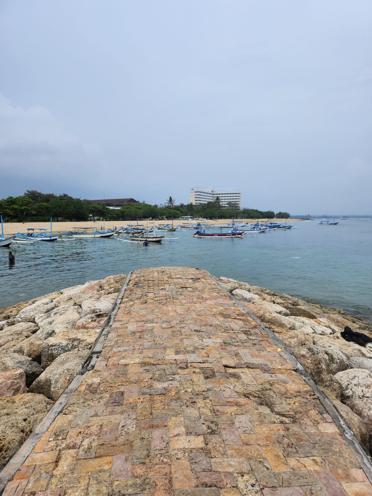
Location: Sanur Beach
Purpose of shoot: Front cover, double page spread, content page
Media language:
- Warm lighting
- Long shot, medium shot, close up shot
Pros:
- Free
- Natural lighting --> no need to buy any lighting equipments
- Easily accessible
Cons:
- Unpredicted weather
- Limited facilities
- Hard to control when it's crowded
Alternatives:
Risk Assessment
Potential Hazards & Evaluation of Risks:
- Unpredictable weather: Since the shoot is done in an outdoor space (the beach) the weather can't be controlled. Since the beach is often windy, sand might be blown into props such as cameras, as well as the model's eyes, which can cause damage and physical pain to the model. If the sunlight is too bright, the lighting will be bad and difficult to control. It might also start raining or get cloudy, which may cause the lighting to be bad too. The shooting might also have to be delayed if it starts raining as the camera can break if it's left under the rain and model might get sick if they are under the rain for a long duration of time during the shoot. In addition, a cloudy/rainy weather will give a different vibe and aesthetic to the whole shoot.
- Limited facilities: Sanur Beach has very few toilets that are located very far away and is difficult to reach. In the case that the model or photographer urgently needs to go to the toilet, it will cause an inconvenience as this will consume quite some time.
- Crowded conditions: The Sanur Beach is popular amongst locals, which causes the location to be packed. Silhouettes of people in the background of the photoshoot will ruin the pictures. In addition to this, some locals may find the photoshoot an annoyance and complain about it, which may cause conflict to arise.
- Can't control MES (mise-en-scene): Since Sanur Beach is a public area, a permit may be needed to bring a large amount of props, as this may disrupt public activity.
Control Measures & Implemented Timeframe:
- Unpredictable weather: Check the weather forecast before going and pick the most ideal date to do the shoot. [± 10 minutes]
- In case of weather forecast lacking accuracy, bring umbrella to shield from rain and intense sunlight.
- Limited facilities: Go to the toilet in a nearby mini market or cafe before going to do the photoshoot [± 20 minutes]
- Crowded conditions: Ask locals regarding the hours and days of the week where it's the least crowded as well as find an area with the least people. [± 5 minutes]
- Can't control MES (mise-en-scene): I'll have to utilize the items and props available there so that I won't cause any trouble. I can also bring small props if I'd like. [doesn't take much time]
Location: Photo studio
Purpose of shoot: Front cover, double page spread, content page
Media language:
- Cool lighting
- Low angle shot & static shot
Pros:
- props and mise-en-scene can be controlled to liking
- lighting can be controlled
- no need to worry about unstable/unpredictable weather
Cons:
- expensive to rent
- limited space
- lack of originality
- boring background
- delays caused by unexpected problems (vehicle problems, setting up equipment, scheduling, etc.)
- My room
Risk Assessment
Potential Hazards & Evaluation of Risks:
- Electrical hazards: Since there are lots of electrical equipments in a photo studio, such as cameras, lighting rings, etc. People are prone to getting electrical shocks and many more.
- Fire hazards: photo studio often contains flammable materials such as fabric backdrops. This may cause some problems to occur if an equipment gets too hot and lights up on fire.
- Trip and fall hazards: There are many props, equipments, and cables in the photo studio that can cause people to trip and fall.
Control Measures & Implemented Timeframe:
- Electrical hazards: find a photo studio that has electrical equipments that are properly maintained. [No specific timing]
- Fire hazards: make sure that the fire exit is clearly marked and easily accessible, as well as make an emergency evacuation plan. [± 30 minutes to 1 hour]
- Trip and fall hazards: Have the cords that securely taped down as well as make sure that paths are cleared up. [± 45 minutes]
Location: Model's room (my friend's bedroom)
Purpose of shoot: double page spread
Media language: close up shot, cool lighting
Pros:
- Doesn't take any money to do the shoot
- More convenient since there's easy access to props and wardrobe items, and there is no need for transportations
- Model will feel more relaxed as they are doing it in their own personal space, giving them comfort
Cons:
- Many distractions (e.g. family members, presence of pets, etc.)
- Lack of professional equipments, since the photoshoot is done in a house, it's very unlikely that they have lots of professional equipments such as ring lights, unlike photo studio
- Limited space compared to photo studio and Sanur beach
Risk Assessment
Potential Hazards & Evaluation of Risks:
- Privacy concerns: having a photoshoot in a bedroom may cause privacy concerns and might make the model uncomfortable, especially when the model is wearing "revealing" clothings.
- Comfort: doing a photoshoot for too long can cause problems like pack pain, eye strain, etc.
- Trip and fall hazard: since the room is a rather small space, the cables and props can cause people to trip over it.
Control Measures & Implemented Timeframe:
- Privacy concerns: Ensure that all the people feel comfortable and ask for their consent when doing certain things that they may feel uncomfortable about. [takes no time]
- Comfort: Take breaks between shoots and provide a comfortable seating. [± 5-10 minute breaks every 30 minutes]
- Trip and fall hazard: Keep path clear from any clutters of props and/or cables [± 15 minutes]
Reflection: doing this task has helped me realize that I mustn't impulsively go to a place just for photoshoot without contemplating the risks that come with it. I should always be as prepared as possible, especially when entering a new area/place. A problem I faced is that the photo studio wouldn't let me take a picture of their studio without paying so I decided to not use the photo studio anymore, therefore left with two choices; model's bedroom and beach. I'm pretty satisfied with the outcome, although I think I'm capable of doing better than this.
Subscribe to:
Posts (Atom)
Final Promotional Package
Below is the final promotional package for our music video project. Music Video: Here is the link to the music video in case the embedded ...
-
This is my research and development for the content page of my fashion magazine References/Research I searched up what the content pages loo...
-
This is the statement of intent that I made with Jasmine's assistance "> Here is the link to the google document incase the emb...
.png)


.png)

.png)
.png)
.png)
.png)


.png)